Expected route
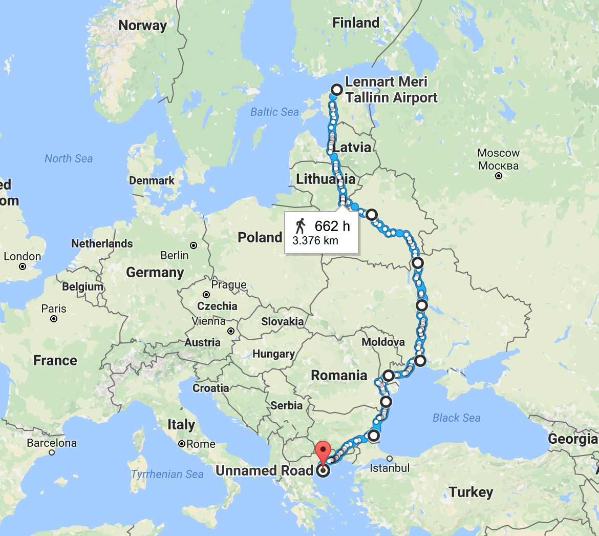
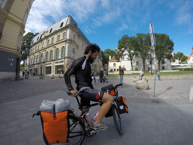
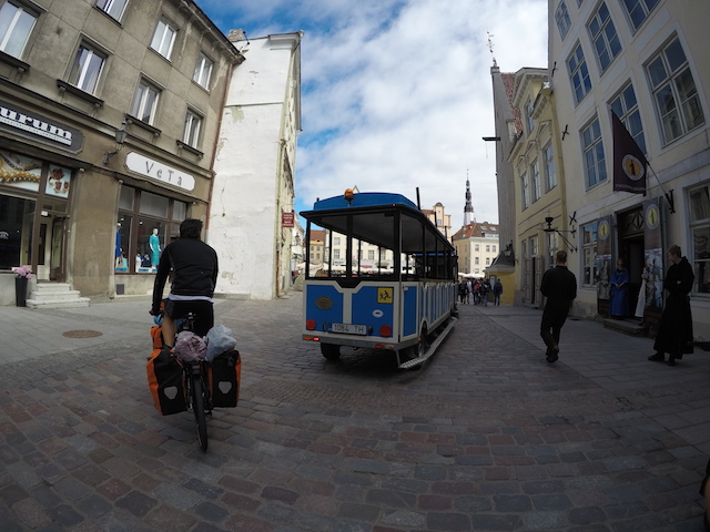
Starting point : Tallinn, Estonia Termination : Thessaloniki, Greece Duration : 30 days Distance: 3376km ETD : 05/07/2017 ETA : 04/08/2017
Starting point : Tallinn, Estonia Termination : Thessaloniki, Greece Duration : 30 days Distance: 3376km ETD : 05/07/2017 ETA : 04/08/2017
PROJECT COUNTDOWN
Born in: 1988 Weight: 81kg Height: 183cm
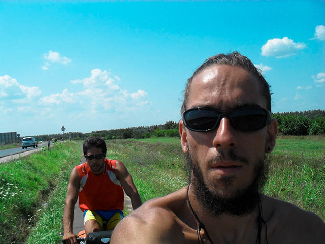
Born in: 1986 Weight: 75kg Height: 175cm
During the trip various data will be collected concerning mapping distances and self-tracking measures, which will be analysed and visualized on this website after the end of the trip.
Here you may check where we are, anytime during the trip. The map will be updated once a day with a new point showing info on the map.
This is the main and the most complex visualization of the whole project. It depicts all active metrics in a way that you can track every step of the trip while we were biking along the route. By clicking on each of the bars on top left of the graph, a set of linegraphs will appear, related to the day of the trip. Additionally, the specified day route will be highlighted with green color on the map. On mouse over the linegraphs, you may navigate through the day routes and a pointer will mark the position on the map. You may also want to check weather and wind data during the trip by adding extra layers on top of the map. To do so mouse over the top right panel of the map and choose which data to show. Play around, it is pure fun!
To sum up the data you saw above, just go through the graph below. Mouse over the linegraphs and see the averages per day or don't, and see the totals and averages of the whole trip. Check the total elevation gain of the trip. It sums up to a quarter way to space!
And here comes the weather data. The two area graphs represent the span between the max and the min temperature and wind for each day. The line in the middle is the average temperature or wind of each day. Mouse over the graph to see the moving circles. It is clear that while we were moving down to the south of Europe, the temperature was rising up. You may also assume that the wind close to the seeside is stronger!
By resting we mean the hearbeat captured by the sensors while sleeping or relaxing. It is compared to the one before and after the trip. The yellow background represents the trip dates. You may see that when you are biking on average 7 hours per day, the heart have the tendency to rest more than usual. Have in mind that the resting heartrate of a healthy man, spread between 60 and 90 bpm. The peak you see on days 9, 10 and 11 is because of a cold and being on medication. Weird no?
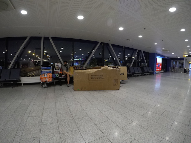
Although we spent 25 out of 28 night on tent, we enjoyed sleeping a lot! Each of the bars below start with the exact time we fall asleep and ends with the time we woke up. The line graph is a sum of the total minutes slept per day. One can inspect the pattern here. While heading south, the sun was setting earlier than in the north, thus we were sleeping earlier and woking up earlier to catch up with the daily program. Day one's sleep was on a bench at Tallinn's airport, that's why it is so short!
Last but not least is a graph depicting the difference between the calories burnt and the calories consumed each day. The green dashed line represents the calories burnt and the red the calories consumed. This graph assumes that when the calories burnt exceed the calories consumed, you eat more than you need so you gain weight. We should mention that Angelos lost 2.5kgs and Andreas kept the same weight so we suppose that we didn't take into account the 2495Kcal that a man with our shape needs to stay alive without having to be on bike all day long. Each blue block on the bottom, represents 0.5L of water consumed by one person.
You may find documentation on how to build a project similar to this one here or you can check the open-source code created for this project by clicking here. You may also contact us, follow us or watch additional pictures and videos of the trip by clicking on the social media icons on top of this webpage. Thank you for the support! I hope you enjoyed as much as we did!
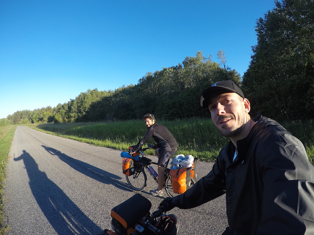
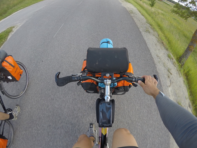
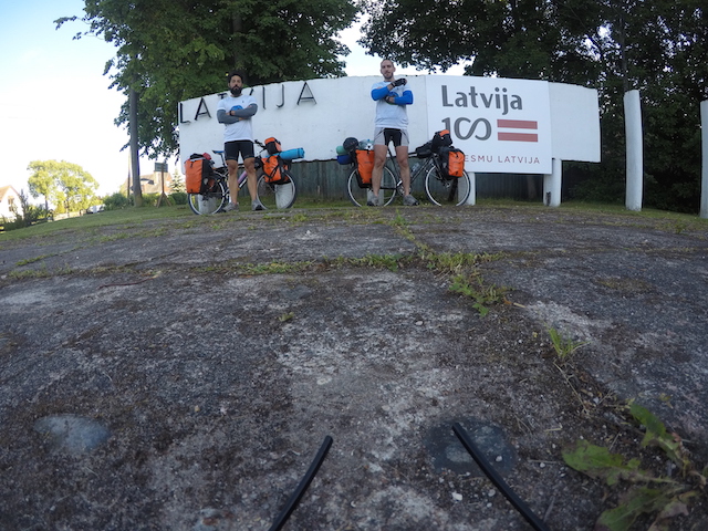
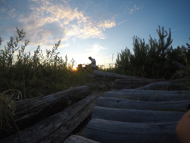
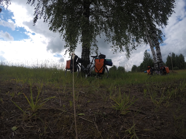
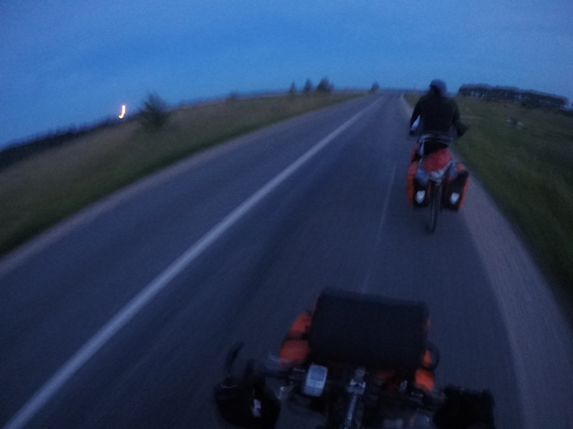
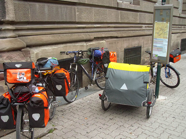
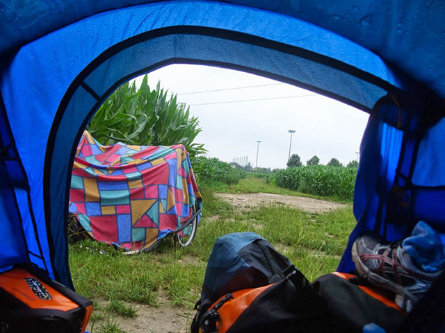
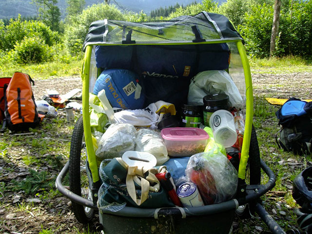
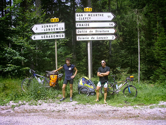
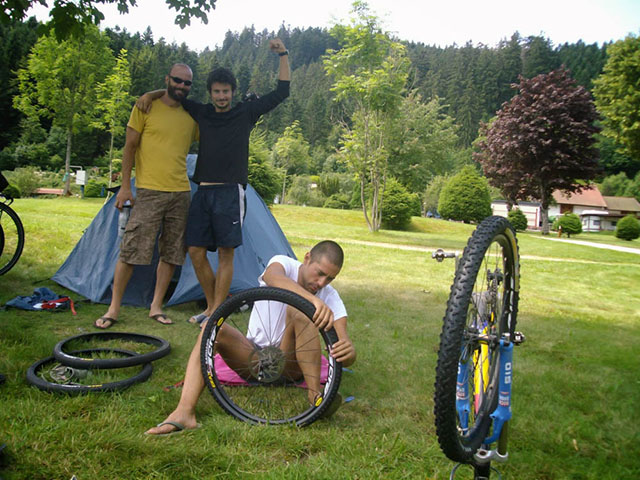
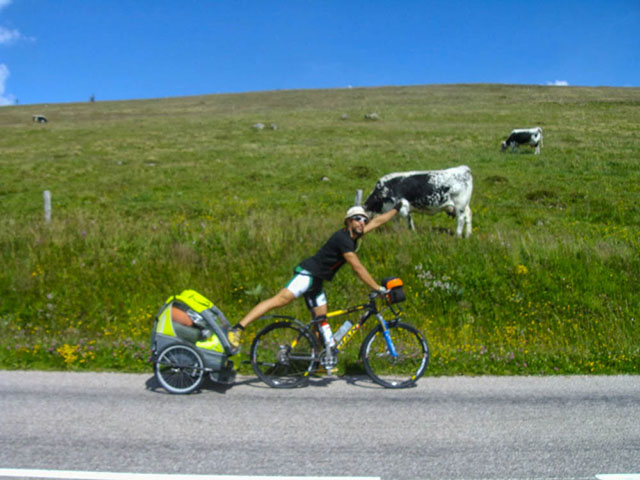
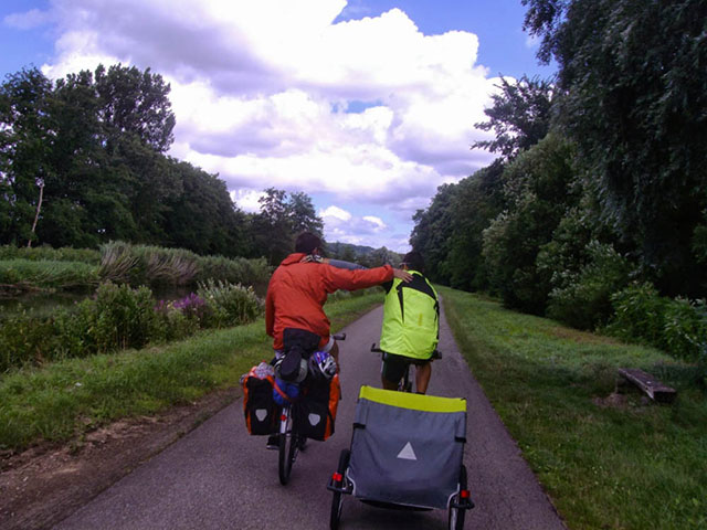
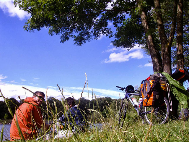
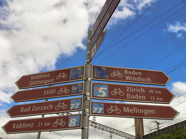
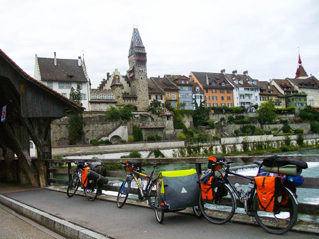
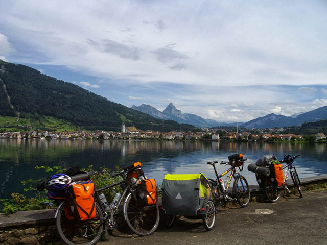
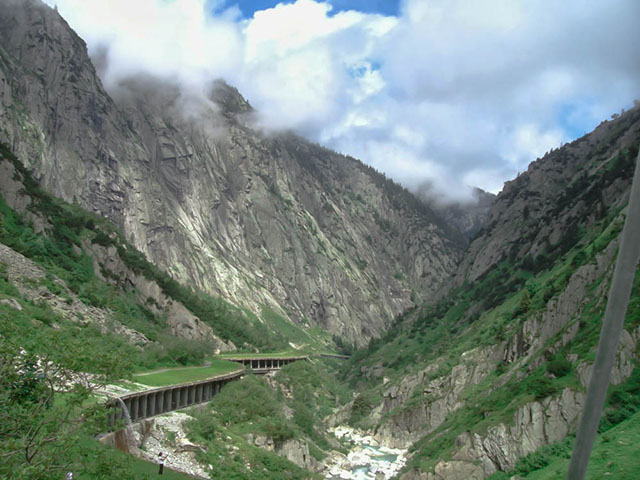
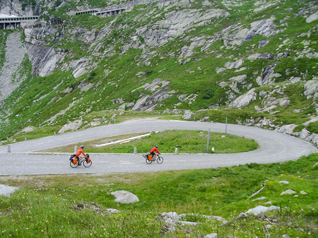
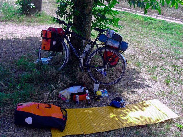
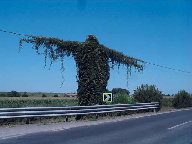
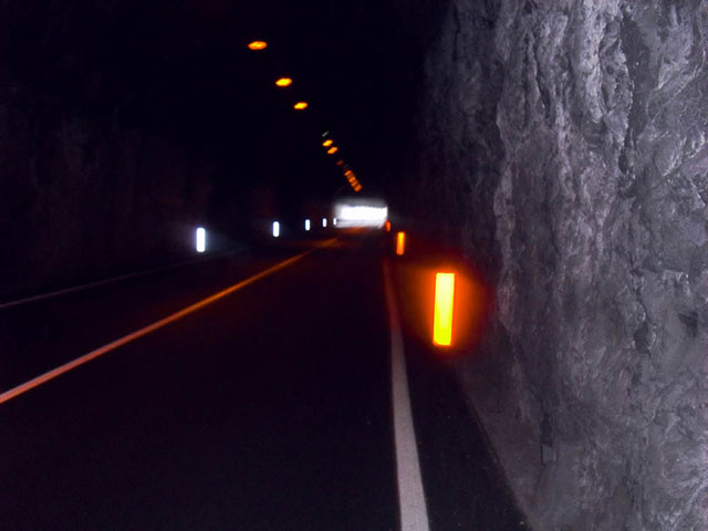
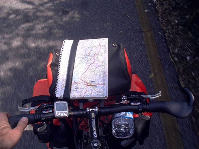
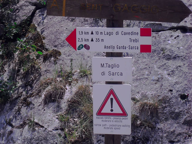
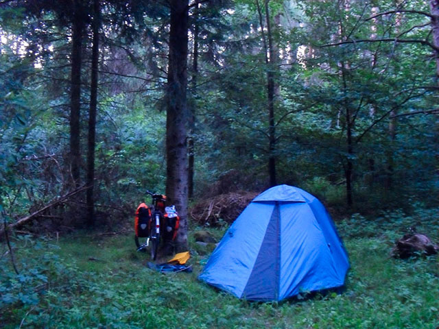
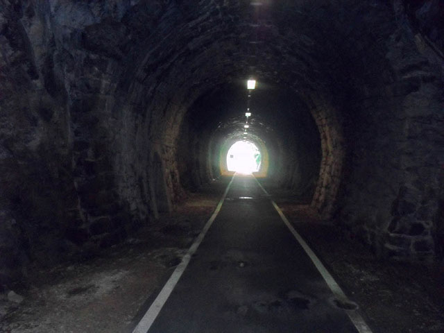
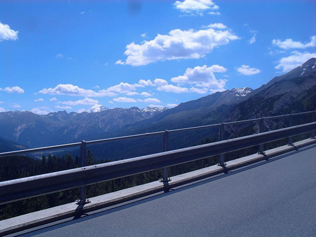
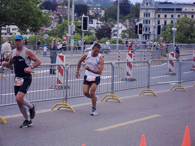
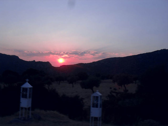
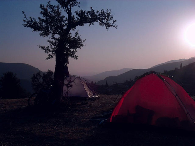
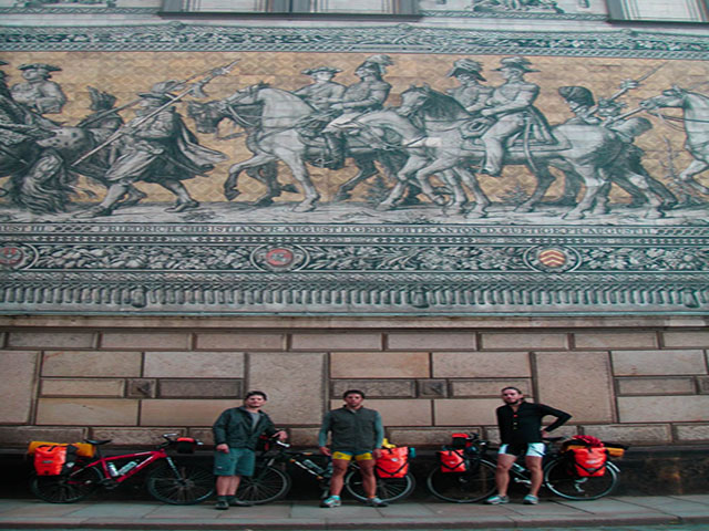
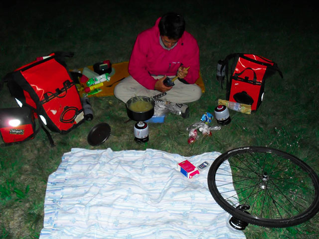
Here you may find images from our previous trips along with updated image from the bike trip project!
Special thanks to the supervisors and the special contributor of the project
Associate Professor at the Department of Applied Mathematics and Computer Science, at the Technical University of Denmark.
Associate Professor at the Department of Applied Mathematics and Computer Science, at the Technical University of Denmark.
Masters student in Digital Media Engineering at the Department of Applied Mathematics and Computer Science, at the Technical University of Denmark
Masters student in Digital Media Engineering at the Department of Applied Mathematics and Computer Science, at the Technical University of Denmark
MADE AT